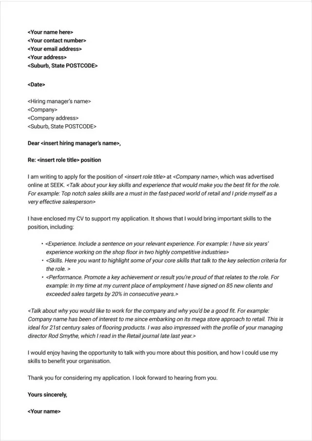
Understanding Cover Letter Fonts Importance
The font you choose for your cover letter is more important than you might think. It’s a small detail, yes, but it speaks volumes about your attention to detail and your understanding of professional communication. In the competitive job market, every aspect of your application must be polished, and the font is no exception. The right font can significantly impact how your cover letter is perceived by potential employers, influencing whether they read further, or not. Choosing the wrong font can detract from your message, making you seem unprofessional or careless. Therefore, dedicating time to select the most appropriate font is a worthwhile investment in your job application strategy.
Why Font Choice Matters
The font you select contributes significantly to the overall effectiveness of your cover letter. It impacts how easily your letter is read, and it also reflects your professionalism. Consider your cover letter a piece of marketing material; it’s selling you to a potential employer. The font is a visual element that contributes to that sale. It should be clear, easy to read, and convey a sense of competence and attention to detail. Moreover, different fonts evoke different feelings. Some project confidence, while others may appear too casual or informal for a professional context. Therefore, selecting the right font is a crucial step in making a positive first impression and conveying the desired image.
Impact on Readability
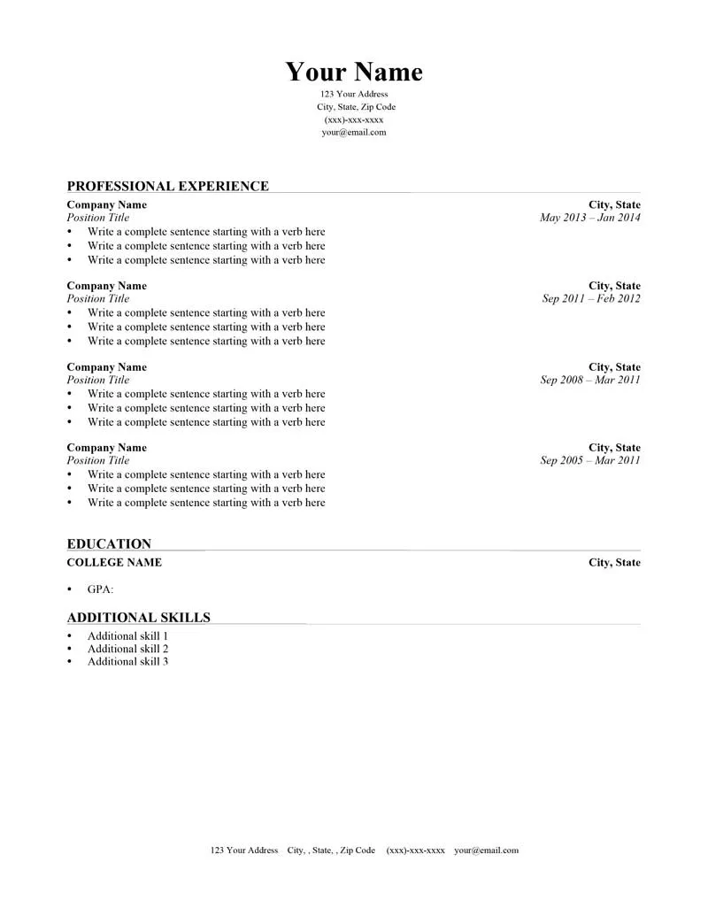
Readability is paramount. A font that is difficult to read, no matter how stylish it may seem, will likely result in your cover letter being discarded. Recruiters and hiring managers often have to sift through numerous applications, so they appreciate the ease of reading. Fonts with clear letterforms, sufficient spacing between letters and lines, and an appropriate size will enable the reader to quickly absorb the information. Font choices that are too ornate, overly thin, or tightly spaced will make your cover letter harder to read, increasing the risk that the reader will lose interest. Prioritize fonts known for their legibility to maximize the impact of your message and enhance the chances of your application being carefully reviewed.
Professionalism and First Impressions
Your font choice immediately shapes an employer’s first impression of you. Fonts have inherent associations; some evoke feelings of professionalism, while others suggest informality. A well-chosen font signals that you understand professional conventions and have taken the time to present yourself carefully. It implies attention to detail and respect for the reader’s time. Conversely, choosing an inappropriate font can undermine your application, making you appear unprofessional or careless. Using a font that is too casual or unusual can lead a hiring manager to question your judgment. The correct font, therefore, contributes directly to your ability to make a favorable first impression and present yourself as a serious candidate.
Top 5 Fonts for Cover Letters
Arial
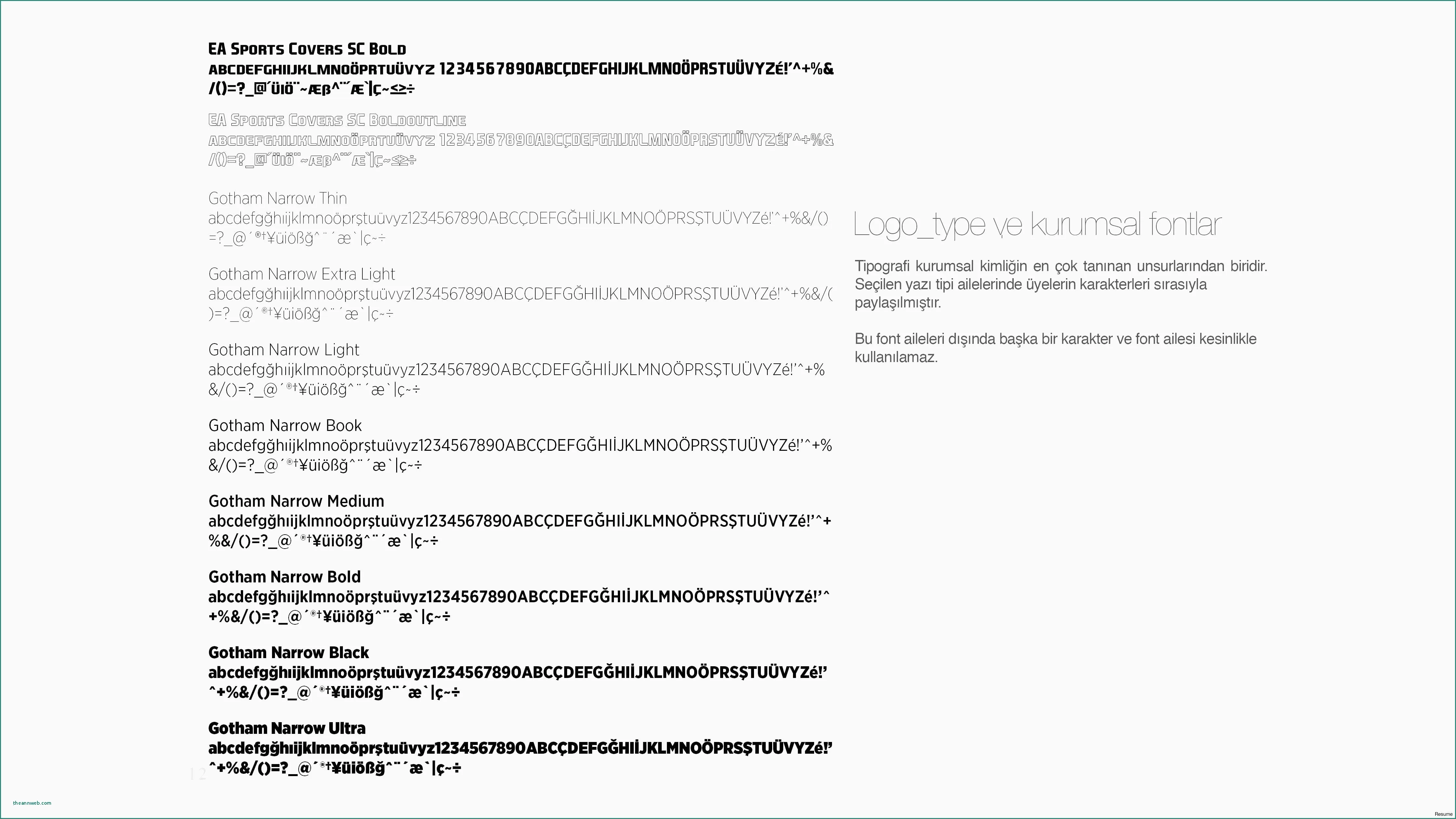
Arial is a widely recognized sans-serif font known for its clean lines and excellent readability. It is a popular choice for cover letters due to its simplicity and versatility. Arial is very easy on the eyes, making it ideal for long documents, like cover letters. It is also a safe choice because it is installed on nearly all computers. Its straightforward style conveys professionalism without being overly formal. Arial can be used across various industries and positions, making it a versatile option. It is a reliable choice for a polished and easy-to-read cover letter.
Characteristics and When to Use Arial
Arial’s characteristics include a clear structure and consistent letter spacing. It is best used in situations where simplicity and clarity are essential. This makes it perfect for industries such as business, marketing, and any field where a clean and professional image is valued. Arial is an excellent choice if you want your cover letter to be easily readable and project a sense of professionalism. Ensure the font size is appropriate, typically between 10 and 12 points, to maintain optimum readability. Arial’s straightforward design makes it an approachable and suitable choice for almost any professional setting.
Times New Roman
Times New Roman is a classic serif font that exudes professionalism and tradition. It is a highly respected and widely recognized font that’s commonly used in formal documents. The serifs, the small strokes at the ends of the letters, give it a traditional, more formal appearance. This font is known for its readability and is suitable for cover letters where a classic and established tone is desired. Its timeless design helps to convey trustworthiness and sophistication. It is a reliable option for cover letters that seek to project a sense of formality and tradition.
Suitability and Common Usage
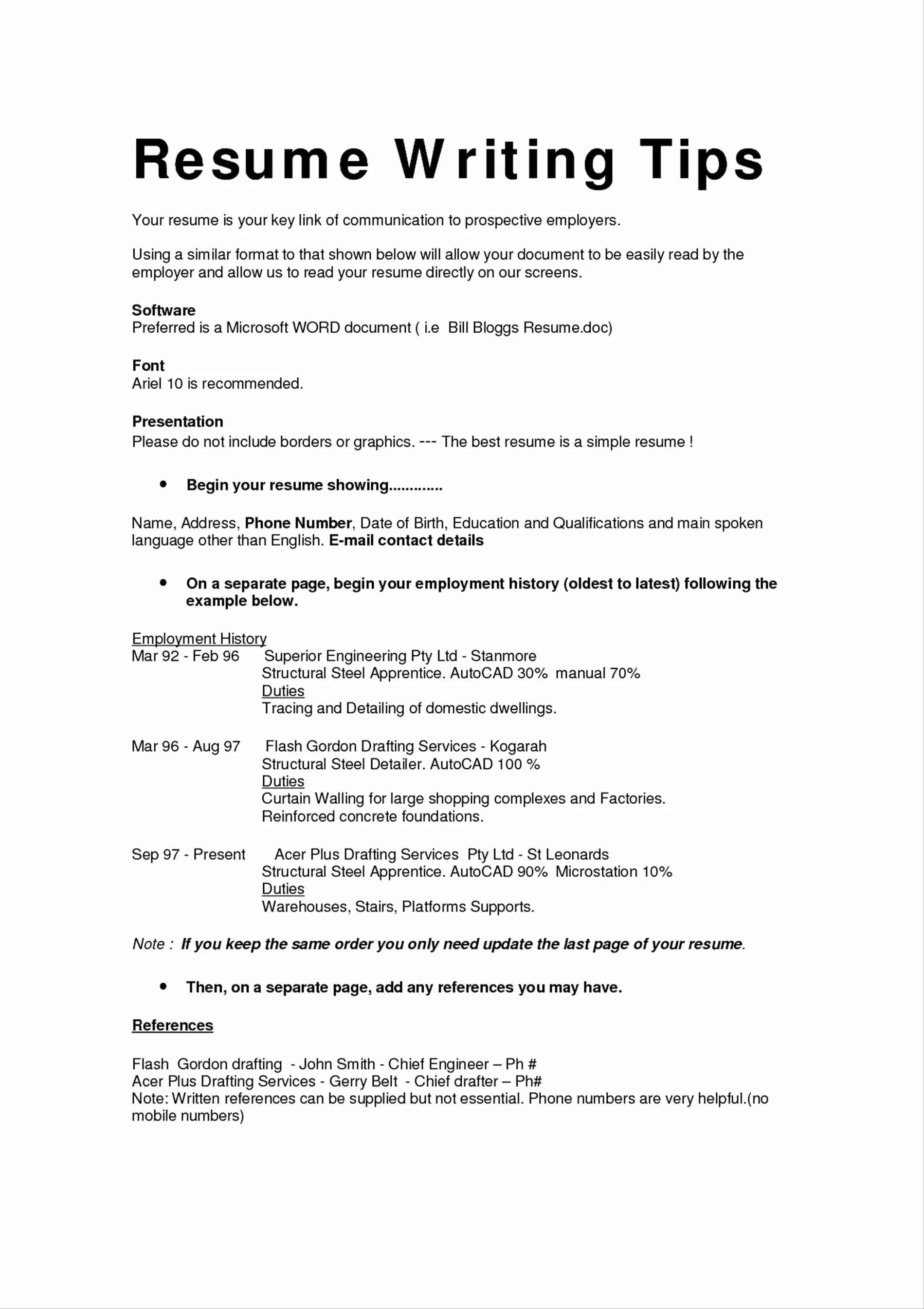
Times New Roman is often used in more conservative industries such as law, finance, and academia. It suits roles where tradition and formality are expected. It is important to use an appropriate font size, usually between 11 and 12 points, for optimal readability. While it’s a safe choice, ensure it aligns with the culture of the company or industry you’re applying to. In fields where a more modern or contemporary approach is valued, other font choices might be more suitable. However, for traditional and formal settings, Times New Roman is always a good option.
Calibri
Calibri is a modern sans-serif font that offers a clean and contemporary look. It’s a popular choice because it is the default font for Microsoft Office, and it’s used widely for its readability across different devices. Calibri provides a good balance between formality and approachability. This font is designed to be easy to read on screen and in print, making it a versatile choice for your cover letter. Its clean lines and open letterforms contribute to a sleek and modern look. When selecting Calibri, make sure the font size is between 10 and 12 points to keep your cover letter easy on the eyes.
Modern and Clean Aesthetics
Calibri’s clean and modern aesthetic makes it suitable for a wide range of professions, particularly in the tech, design, and marketing fields. It conveys professionalism without being overly formal. This makes it a good choice for companies with a more modern and contemporary culture. Calibri is a very flexible choice. It works well in almost any industry, presenting you as someone who is up-to-date with current design trends. Calibri is an excellent option for a modern and clean cover letter that still communicates professionalism and competence.
Garamond
Garamond is a serif font that is known for its elegant and classic style. It provides a sophisticated and refined appearance, making it a great choice if you want your cover letter to stand out. Garamond is famous for its excellent readability. It is designed to be easy on the eyes, even in large blocks of text, which makes it ideal for cover letters. Its refined serifs and balanced letterforms convey a sense of elegance and attention to detail. Garamond projects a sense of sophistication and refinement. Its timeless design makes it suitable for a variety of industries.
Elegant and Classic Style
Garamond’s elegant and classic style suits industries like the arts, literature, and design. It is suitable when you want to portray a refined and cultured image. To ensure that the font retains its readability, maintain a font size between 11 and 12 points. Garamond is a strong choice for those who wish to communicate sophistication and class in their cover letter. However, always consider the overall tone of the job and the company you are applying to. It may not always be the most suitable font if the company culture leans toward a more contemporary aesthetic.
Helvetica
Helvetica is a highly versatile and legible sans-serif font. Its clean, neutral design has made it an iconic choice for various applications. Helvetica is renowned for its simplicity and excellent readability. This makes it a great choice for cover letters. It conveys a sense of professionalism and modernity. Helvetica’s clean lines and consistent letterforms make it a very versatile choice. It is often used to communicate a sense of efficiency and clarity. The font’s timeless design makes it a solid option for various industries. Its versatility makes it an easy choice for almost any job application.
Versatility and Legibility
Helvetica’s versatility and legibility make it suitable for a wide array of industries, from tech and marketing to more traditional fields. Ensure you maintain a font size between 10 and 12 points for optimal readability. Helvetica’s neutrality ensures it won’t clash with your content. It is a good choice for a wide range of professional contexts. Consider that while Helvetica is widely recognized, its neutrality also means it does not have the same distinct character as some other fonts. Therefore, it’s perfect for those who want a clean, professional, and easy-to-read cover letter.
Other Font Considerations
Font Size Guidelines
Choosing the correct font size is just as crucial as selecting the font itself. A font that’s too small can be difficult to read, while one that’s too large can appear unprofessional and overwhelming. Generally, a font size between 10 and 12 points is recommended for most cover letters. This size ensures optimal readability while maintaining a professional appearance. Always make sure the font size is consistent throughout the document. Deviating from these guidelines can impact your application. Pay attention to font sizes, especially when you’re applying for roles where attention to detail is highly valued.
Font Size Recommendations
For most fonts like Arial, Calibri, and Helvetica, a font size of 11 points is generally ideal. Times New Roman might look best at 12 points. However, make adjustments based on the specific font and your preferences. Ensure that the text is easy to read. Test your cover letter by printing it out to see how it looks. The readability on paper can be different from what you see on the screen. When submitting your cover letter electronically, consider the potential for it to be viewed on a variety of devices and screen sizes. Choose the size that ensures it remains legible under different viewing conditions. Experiment to find the most suitable font size to enhance your application.
Font Styles to Avoid
While there are many excellent fonts for cover letters, certain font styles should be avoided. These can detract from the professionalism of your application. Some fonts are not appropriate for formal documents. They can create a negative impression. It is essential to be aware of which fonts to avoid. By doing so, you increase the likelihood of your application being well-received. Be sure to use a font that will make you look your best.
Fonts that look unprofessional
Fonts like Comic Sans, Papyrus, and Curlz are generally considered unprofessional and unsuitable for any serious professional document, including cover letters. These fonts often appear too casual, playful, or even childish, which undermines the seriousness of your application. Avoid fonts that are overly decorative, overly stylized, or difficult to read. These can make your cover letter hard to understand and make you look less prepared. Steer clear of fonts that are too unusual or trendy. These can distract from your message. Your focus should be on the content, not the font. Instead, select fonts that offer clarity and a professional aesthetic to increase your chances of success.
Consistency and Formatting Tips
Maintaining consistency in your formatting is essential for a polished cover letter. Use the same font and font size throughout the entire document. This includes the body text, headings, and any other elements such as your name and contact information. Ensure consistent line spacing, usually single or 1.15, and clear paragraph breaks. These elements make your cover letter easy to read and well-organized. Avoid using excessive bolding or italics. They can clutter your document. Proofread carefully and ensure that your formatting is consistent. This helps to demonstrate your attention to detail and professionalism.
Best Practices for Cover Letters
In addition to font selection, follow these best practices to ensure your cover letter is effective. Your cover letter is your opportunity to make a great first impression. You can stand out from the competition by following these helpful guidelines. These best practices will help make your cover letter more effective and increase your chances of getting the job.
Reviewing and Proofreading
Always proofread your cover letter carefully before submitting it. Check for any grammatical errors, spelling mistakes, and formatting inconsistencies. A well-written and error-free cover letter shows your attention to detail and professionalism. Read your cover letter aloud or have someone else review it. This can help you catch errors that you might have missed. Proofreading is crucial. It is an essential step in the job application process. An error-free cover letter demonstrates respect for the hiring manager and boosts your credibility.
Formatting for ATS systems
Many companies use Applicant Tracking Systems (ATS) to manage job applications. Formatting your cover letter to be ATS-friendly can help ensure that it is properly scanned and read by the software. Use a simple, clean format. Avoid using complex tables, images, or unusual formatting. Choose a widely recognized font, such as Arial or Calibri. This helps the system extract your information accurately. Save your cover letter in a standard format, such as .doc or .pdf. Follow these guidelines to ensure your cover letter passes through the ATS smoothly and reaches the hiring manager.
